Vanco Payments
Fintech

Results
Design System Adoption Implemented across 40+ products Time to Design New Features Decreased due to reusable components Product Identity Unified branding and visual consistency Donation App Launch Delivered on time with improved UX flow
Link
Vanco Payments – Unified UI & Launched Donation App in 20 Months
Project: Design system creation and donation app launch
Outcome: Unified UI across 40+ products, reduced time-to-design for new features, on-time donation app release
Client: Vanco (payment solutions for churches, schools & nonprofits)
Role: Senior Product Designer
Team: Product managers, engineers, stakeholders
Timeline: 1 year, 7 months
TL;DR
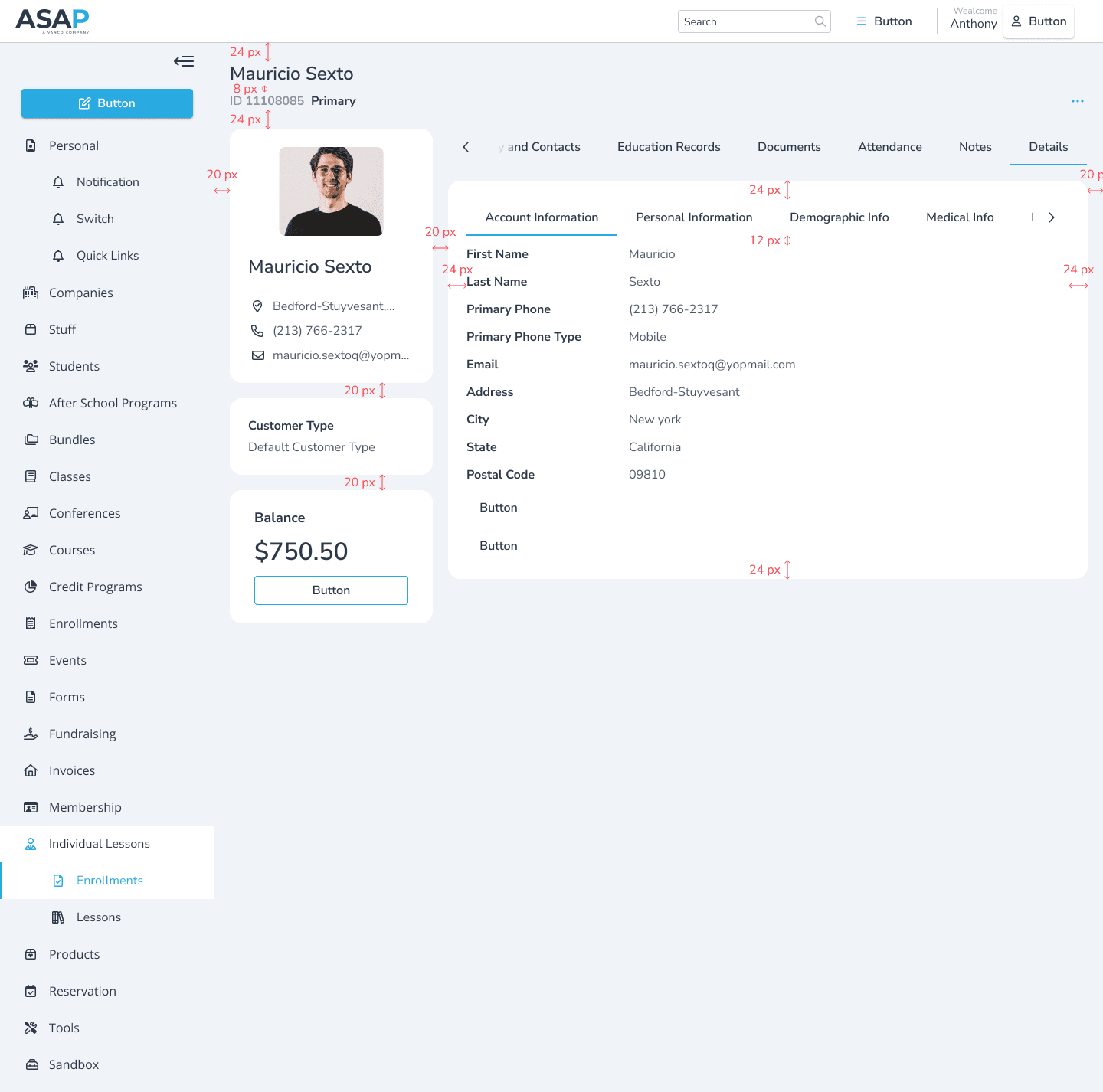
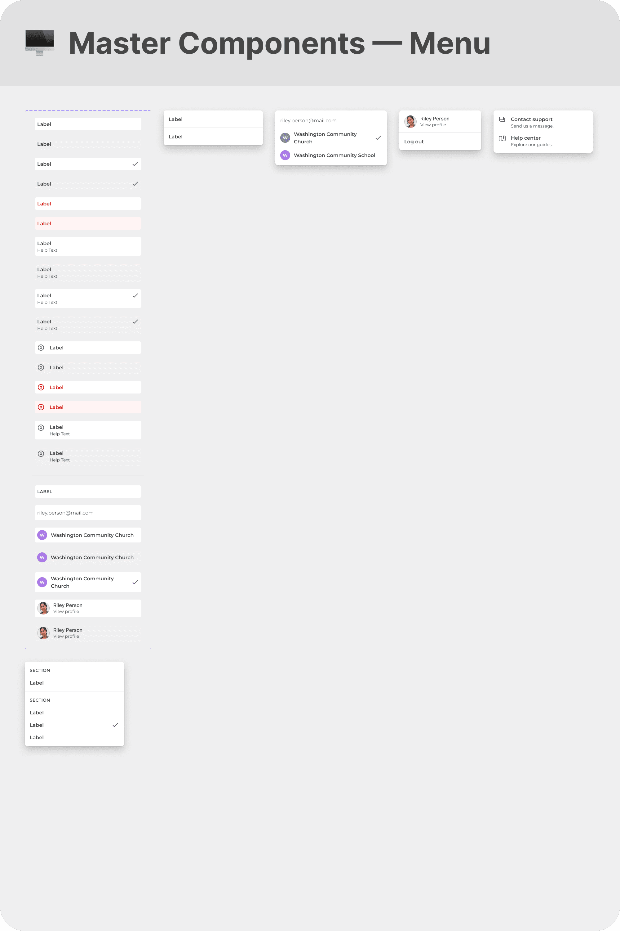
I built a centralized, token-based design system that aligned branding and UX across 40+ siloed products—streamlining development, improving consistency, and successfully launching a flagship donation app.
Outcome / Problem Statement
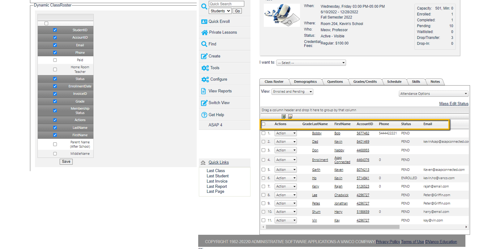
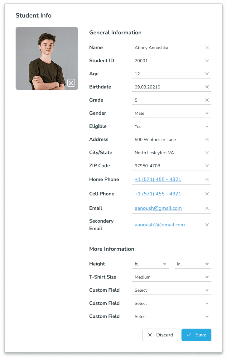
Vanco’s product suite had grown without central coordination, leading to inconsistent UI, duplicated efforts, and a fragmented user experience. This created inefficiencies internally and frustration for end-users.
Goal: Consolidate multiple UI libraries into one scalable design system, unify brand identity, streamline development, and support the donation app launch.
Users and Needs
Administrators from churches, schools, and nonprofits needed cohesive, user-friendly interfaces across donor-facing and internal tools. UX inconsistency added complexity and reduced confidence.
My Role & Team
As the individual Senior Product Designer, I led UX strategy, created the design system framework, and partnered with PMs, engineers, and stakeholders to ensure company-wide adoption.
Constraints & Process
Constraints:
Legacy products with siloed UI libraries
Need to support ongoing product development and a major app launch
Stakeholder alignment required across teams
Process:
Conducted UX audits and stakeholder workshops
Performed heuristic reviews and competitor benchmarking
Synthesized insights to define modular, scalable design patterns
Audited five UI libraries and refactored components into one token-based system
Launched documentation and governance model to drive system adoption
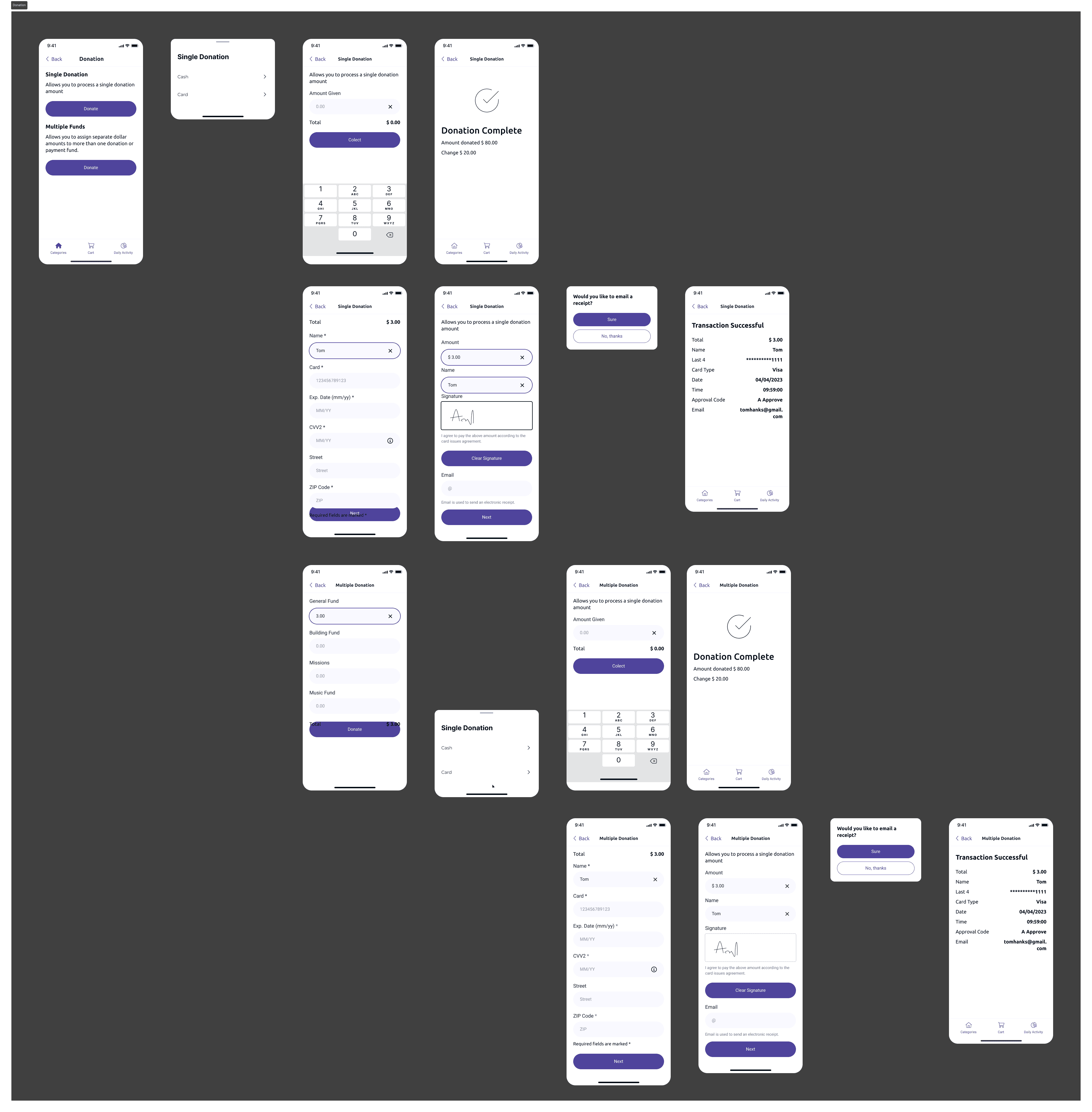
Supported UX strategy and implementation for the new donation app
Results & Impact
Design System Adoption: Deployed across 40+ products
Faster Feature Launch: Reduced time to design new features via reusable components
Stronger Brand Identity: Visual and interaction consistency across platforms
Donation App Success: Delivered on time with improved UX flows aligned to unified system
Key Takeaways
Centralized design systems drive strategic UX and scale
Modular components and governance models enable long-term consistency
Aligning UX with brand identity builds user trust and accelerates development
What's Next
Expand the governance model to on-site integrations (e.g., APIs)
Build a UX maturity dashboard to measure system consistency
Roll out modular design patterns to new product verticals