Consumer Fusion Mobile App for Reputation Management
Marketing
Results
Post-launch analytics indicated a significant increase in user engagement and task efficiency. The streamlined interface and improved feature accessibility led to higher user satisfaction and a reduction in support inquiries related to navigation issues.
Link
Consumer Fusion Mobile App – Boosted Review Engagement by 66%
Project: Revamp of mobile app for reputation management
Outcome: Reduced task time by 66%, increased key feature engagement by 35%
Client: Consumer Fusion
Role: UX Designer & Product Strategist
Team: Product Manager, 2 Engineers, QA Analyst
Timeline: 8 weeks
TL;DR
I redesigned Consumer Fusion’s mobile app to simplify feature access and improve usability. As a result, task time dropped from 3 minutes to 1, and use of the social media tool jumped from 25% to 60%.
Outcome / Problem Statement
The app’s core features—sending review requests and managing social media—were buried and underused. Business owners couldn’t find what they needed quickly, leading to low engagement and negative feedback.
Goal: Make high-impact tasks accessible within 2 taps and increase user engagement with the app’s main value drivers.
Users and Needs
The app served small business owners managing their public reputation across platforms. These users needed to:
Send review requests with minimal effort
Monitor/respond to online reviews
Manage basic social media activity
The existing experience was slow, inconsistent, and fragmented—creating friction and frustration.
My Role and Collaboration
I owned the full UX strategy, from discovery to delivery:
Mapped IA, created wireframes and prototypes
Led stakeholder interviews and usability testing
Delivered high-fidelity designs in Figma
I collaborated with the PM and devs to ensure feasibility and design intent remained intact during implementation.
Constraints and Process
Constraints:
Tight 8-week timeline
Live user base with mixed tech familiarity
Legacy back-end API requirements
Process Overview:
Audited analytics to identify feature drop-offs
Ran stakeholder interviews and user surveys
Built new information architecture to prioritize business-critical tasks
Designed low- and high-fidelity prototypes
Conducted usability testing and iterated based on insights
Design and Iteration Highlights
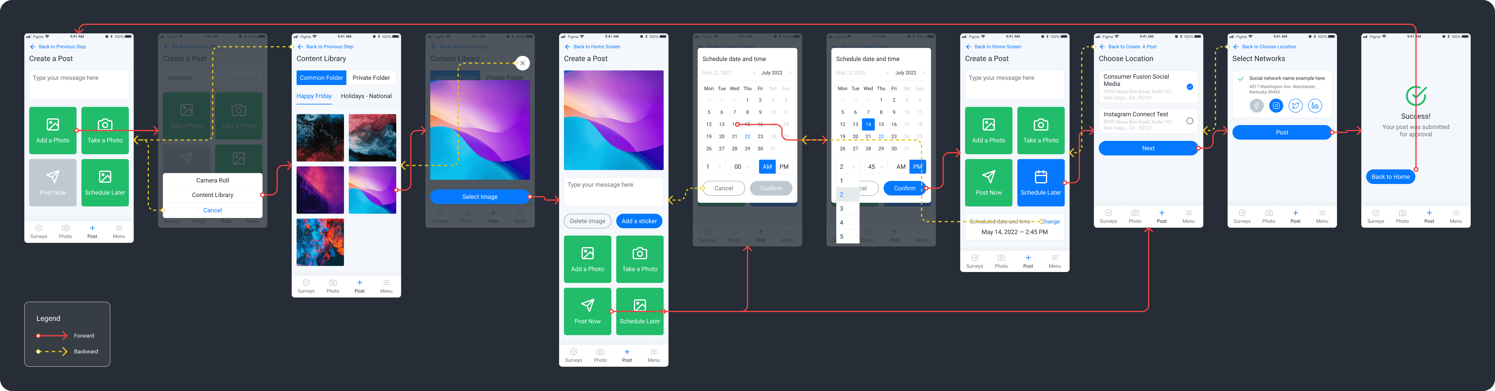
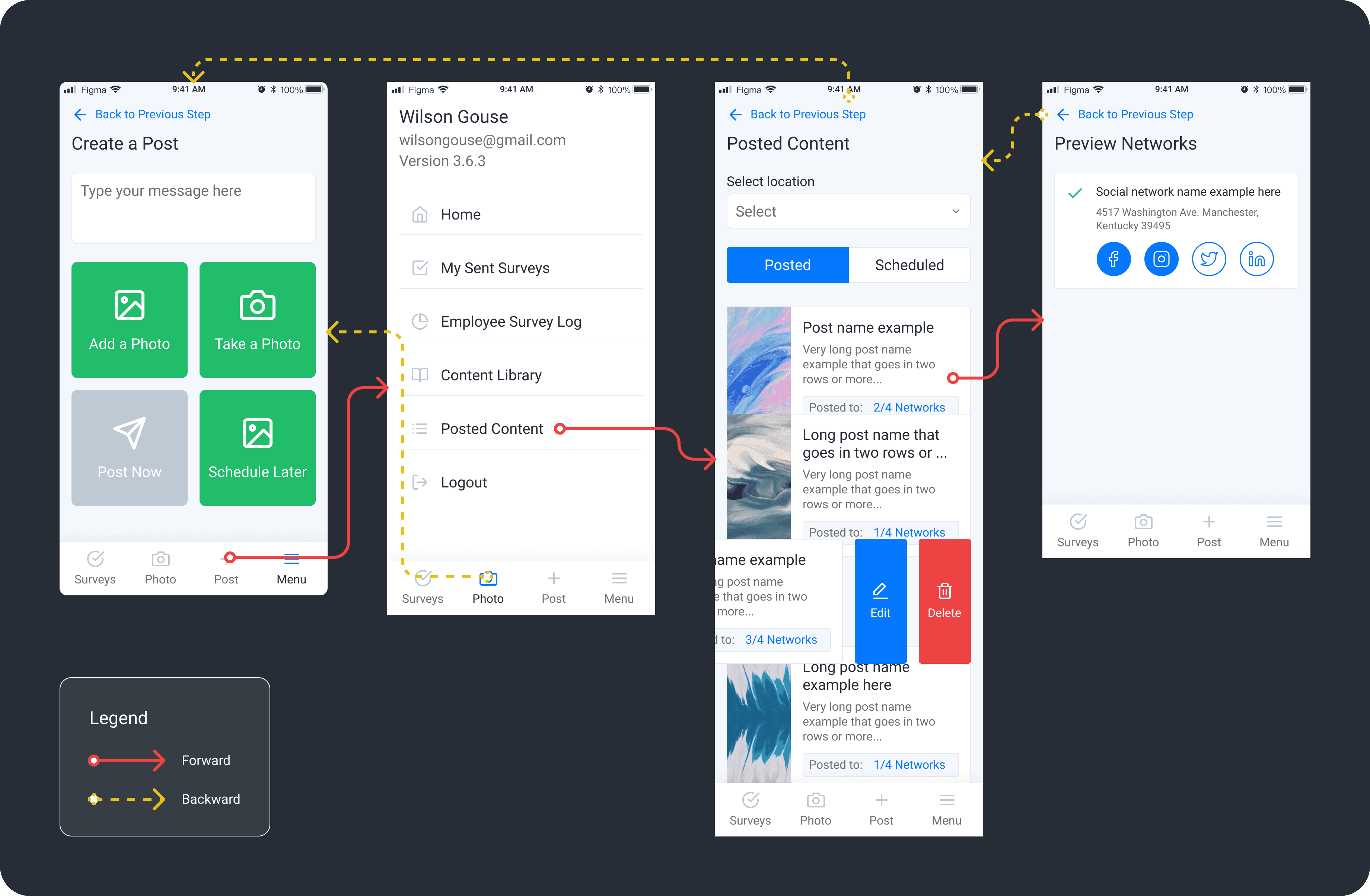
1. Information Architecture Redesign
Grouped features into intuitive categories and introduced bottom navigation for instant access to Reviews, Social, and Settings.
2. Quick Access Enhancements
Designed shortcut actions directly on the home screen to reduce clicks for common tasks like sending review requests.
3. Onboarding Improvements
Added a contextual, tap-through onboarding tutorial to help first-time users complete a review request in under 60 seconds.
4. Visual and Interaction Updates
Unified the visual design with the desktop platform. Focused on readability, clarity, and scalable UI patterns.
Results
Metric | Before | After | Change |
|---|---|---|---|
Avg. time to send review request | 3 minutes | 1 minute | -66% |
Social feature engagement | 25% | 60% | +35 percentage pts |
User satisfaction (1–5 scale) | 3.2 | 4.6 | +1.4 points |
Feature discoverability | 40% | 85% | +45 percentage pts |
The redesigned app launched on iOS and Android with positive early feedback from both users and internal support teams.
Key Takeaways
Simplifying access to essential features improved both speed and user confidence
Prioritizing progressive disclosure helped reduce cognitive overload without sacrificing functionality
Continuous user feedback allowed for agile, meaningful iteration
What’s Next
Integrate push notifications to improve engagement
Begin research on multilingual support for franchise clients
Expand data visualization features for more advanced users