Cyborg Security
Cyber Space

Results
Reduced user abandonment significantly across investigative flows Helped threat hunters complete tasks faster, with higher confidence
Link
Cyborg Security – Reduced Drop-Off in Threat Intelligence Tool by 67%
Project: Workflow Redesign of Threat Investigation Tool
Outcome: Cut user drop-off by 67%, improved confidence and completion rates
Client: Cyborg Security – Hunter
Role: UX Designer & Research Lead
Team: 1 PM, 2 Engineers, 1 Data Analyst
Duration: 2 months
TL;DR
I redesigned the investigative workflow in a cybersecurity tool to reduce cognitive overload. The result: a 67% decrease in drop-offs, a 69% improvement in time-to-first-insight, and a task success rate that more than doubled.
Outcome / Problem Statement
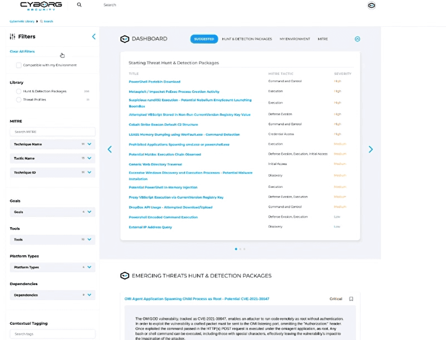
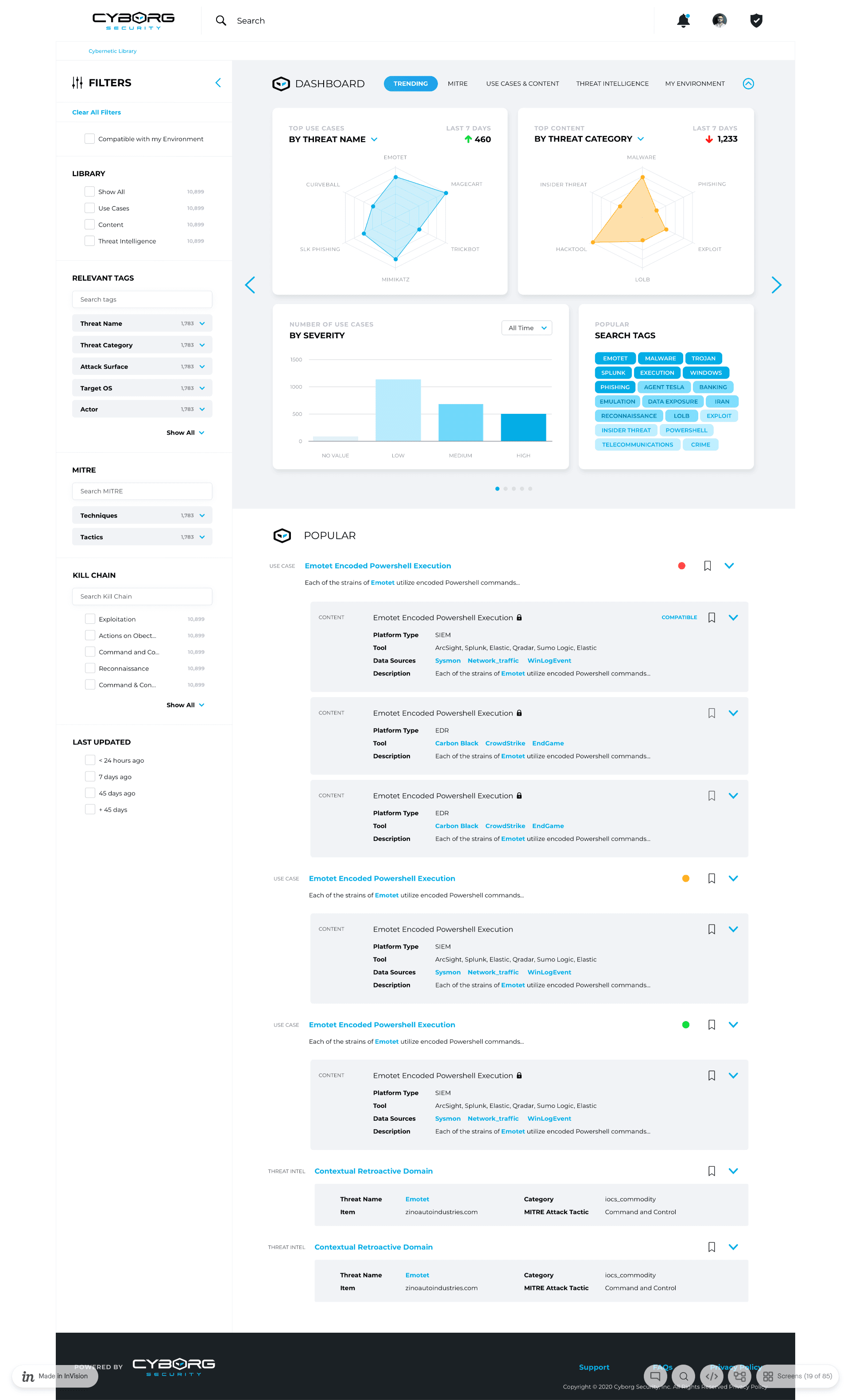
The platform gave threat hunters access to deep intelligence—but overwhelmed them in the process. Every search returned a wall of data with no clear prioritization.
Drop-off rate during core flows: 60%
Key insight buried under irrelevant noise
High cognitive load and low confidence
Goal: Redesign the workflow and UI to reduce cognitive load, streamline triage, and help users focus on what matters—fast.
Users and Needs
The tool served cybersecurity analysts and threat hunters working under time pressure.
They needed:
Fast triage of Indicators of Compromise (IOCs)
Relevant information surfaced first
A layout that matched their investigative mindset
Most weren't looking for less data—they needed structure and context.
My Role and Team
I led UX research and design.
Planned and ran all user interviews and workflow mapping
Created wireframes, prototypes, and information models
Facilitated collaboration across engineering and product
Conducted usability testing with key users
Constraints and Process
Timeline: 8 weeks
Constraints: Existing tech stack had to remain intact
Approach:
Contextual interviews with 5 experienced threat hunters
Mental model + workflow mapping
Inventory of UI content and task relevance
Competitor analysis to benchmark triage efficiency
Prototyping and user testing in 2 cycles
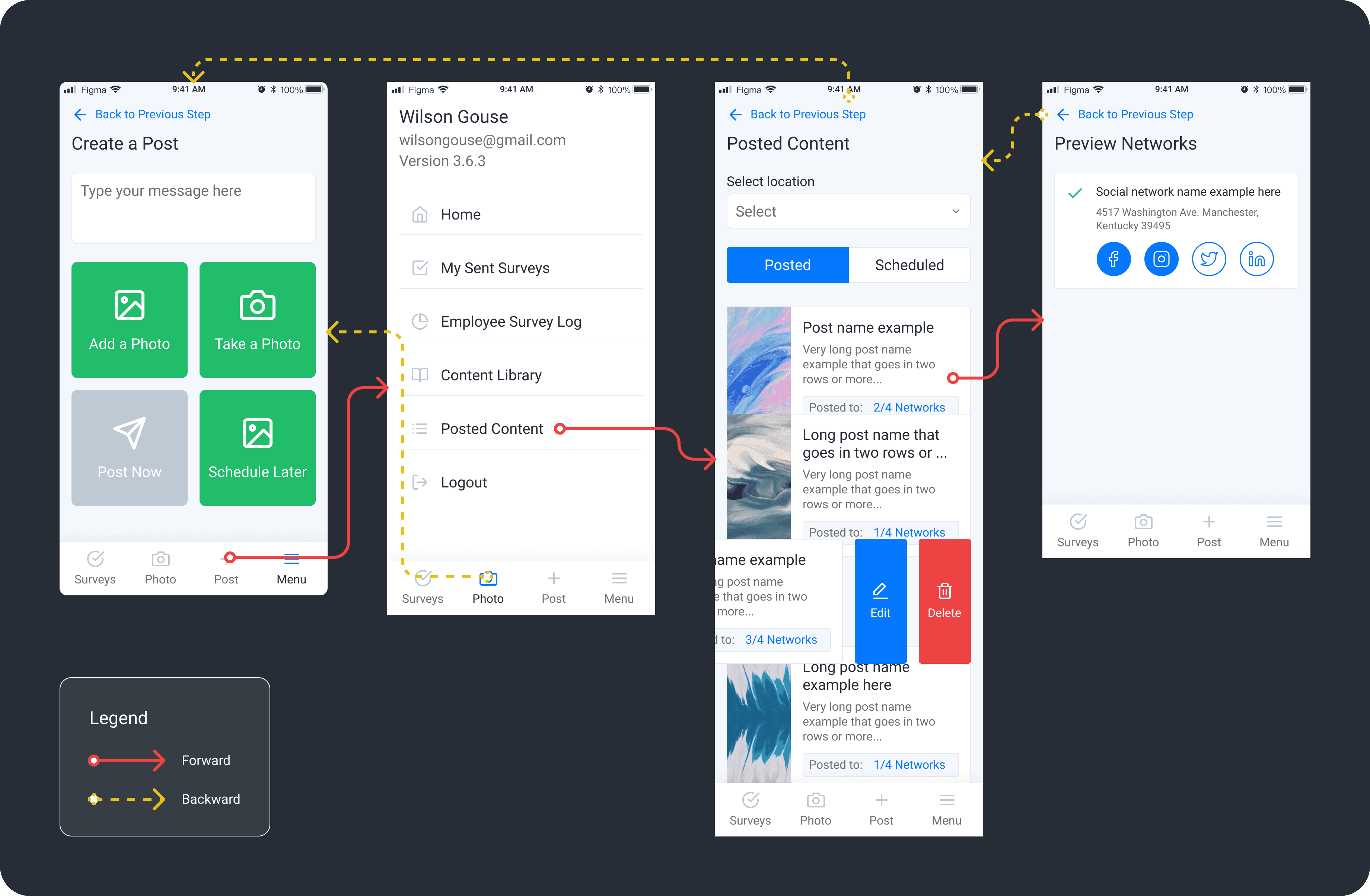
Design and Iteration Highlights
Workflow Mapping: Focused on triage, enrichment, and link analysis decision points
Information Architecture: Grouped data by investigative priority (Immediate, Contextual, Historical)
Progressive Disclosure: Showed only what users needed up front; hid the rest until they asked
Wireframes and Testing: Built task-specific layouts for common entities (Domain, IP, File Hash)
Iteration Based on Feedback: Reordered data cards, collapsed noise, highlighted high-confidence indicators
Key Metrics (Before vs After)
Metric | Before | After | Change |
|---|---|---|---|
Drop-off Rate (search flow) | 60% | 20% | -67% |
Time to First Insight | 4.2 mins | 1.3 mins | -69% |
Task Success Rate | 45% | 91% | +102% |
User Confidence (1–5 scale) | 2.4 | 4.3 | +1.9 points |
Redundant Info Displayed | High | Low | Drastically reduced |
Design Features That Worked
Simplified Result View: Loaded only essential data, with expandable sections
Entity-Centric Layouts: Consistent templates for IPs, Domains, Hashes, etc.
Relevance-Based Grouping: Prioritized fields based on typical task sequence
Progressive Disclosure: Advanced filters and metadata shown only on demand
Iteration Example
Initial Design:
All data loaded at once in a dense, scroll-heavy layout.
User Quote:
“I can’t tell what’s important. I waste time figuring out what not to read.”
Redesign:
Introduced collapsible data cards, reordered content based on task stage, visually emphasized signal over noise.
Final Outcome
The new design cut drop-offs in half and helped analysts move through investigations with less friction.
Dramatically increased task success rates
Boosted user confidence
Set the foundation for a scalable, relevance-first design system
Reflection
This wasn’t a matter of reducing data, but reframing it. The real insight?
Users don’t want less—they want clarity.
Understanding how they think and sequence tasks mattered more than adding features.
If we had involved users before the MVP shipped, we could have avoided early churn and rebuilt trust faster.
Next Steps
Add role-based customizable views
Introduce AI-based prioritization of indicators
Run longitudinal studies to measure full investigation efficiency