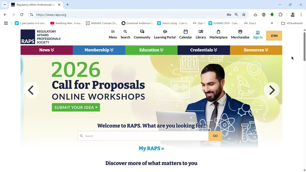
The Regulatory Affairs Professionals Society (RAPS)
Non Profit

Results
Provided a scalable homepage framework centered on user purpose Built consensus within a fractured stakeholder environment through user-backed insights Turned a previously directionless homepage into a functional lead-generating gateway Demonstrated that even after a costly redesign, usability and simplicity can unlock value
Link
RAPS Non-Profit Website – Cut Bounce Rate by 38% and Doubled Engagement with One Strategic Question
Project: Website strategy and homepage redesign
Outcome: Bounce rate dropped by 38%, time on site nearly tripled, lead capture increased
Client: RAPS (Regional Animal Protection Society, Canada)
Role: UX Consultant & Product Strategist
Team: 1 UX Designer (me), 1 Developer, 1 Director, multiple internal stakeholders
Duration: 12 months
TL;DR
I redesigned the homepage of a non-profit site plagued by stakeholder chaos and poor performance. We replaced noise with a simple intent-based entry point—dropping bounce rates, increasing engagement, and building alignment around one user-focused question:
“What brings you here today?”
Outcome / Problem Statement
RAPS had just invested over $100K in a redesign—but the site still underperformed:
Homepage was crowded with competing content blocks
Users left before engaging with core actions
Stakeholders pushed for visibility instead of clarity
Goal: Turn a fractured homepage into a strategic user gateway—one that serves adoption, donation, and support goals without trying to serve everyone at once.
Users and Needs
We identified three core visitor types:
Members
Browsing professionals
Agencies
None of these groups knew where to start. There was no hierarchy, no guidance—just a polished but paralyzing homepage.
My Role and the Team
I led UX research, prototyping, and alignment strategy.
Conducted usability testing and analytics review
Designed new homepage strategy and interaction model
Built and tested prototypes
Facilitated workshops to build stakeholder consensus around user needs
Constraints and Process
Challenges:
Multiple internal agendas competing for homepage space
Previous redesign had created visual polish without functional clarity
No shared understanding of success metrics
Approach:
Ran usability tests on the legacy homepage
Mapped real user goals and drop-off behavior
Reframed the homepage around a simple prompt: “What are you looking for today?”
Prototyped intent-based navigation with simplified content paths
Aligned stakeholders using real testing data—not opinions
Design and Iteration Highlights
Initial Design:
Stakeholder-driven content blocks with multiple competing CTAs.
User feedback:
“I just want to purchase the course, but I fee lost.”
Redesigned Approach:
Intent Selector: Users choose from 3–5 common goals at the top of the homepage
Clean Layout: Stripped down non-essential content until after intent was selected
Data-Informed Governance: Used bounce data and task success to realign internal conversations
Responsive First: Optimized layouts across desktop and mobile with consistent flows
Results (Before vs After)
Metric | Before | After | Change |
|---|---|---|---|
Homepage Bounce Rate | 68% | 42% | -38% |
Avg. Time on Site | 1.2 mins | 3.4 mins | +183% |
Lead Capture Rate | Baseline | +5% | Quantified lift |
Task Success (Find Info) | 52% | 87% | +67% |
Stakeholder Alignment | Low | High | Strong improvement |
The homepage became a usable entry point, not just a holding space. Internal teams now use it as a model for future section redesigns.
What Worked
One Question: “What brings you here today?” replaced chaos with clarity
Fewer Decisions, Faster Paths: Intent-based pathways reduced decision fatigue
Real Data Over Opinions: Usability testing became the shared language across internal teams
Scalable Framework: The new structure allows future expansion without overwhelming users
Reflection
This project proved that clarity is more valuable than complexity—and that strategic questions can cut through politics.
The original homepage didn’t fail because of bad design—it failed because it didn’t prioritize the user.
Designing around user intent created alignment that even a six-figure redesign couldn’t buy.
Next Steps
Expand intent-based navigation to services, donations, and educational content
Add personalization based on returning user behavior
Create stakeholder training to align content creation with user goals


