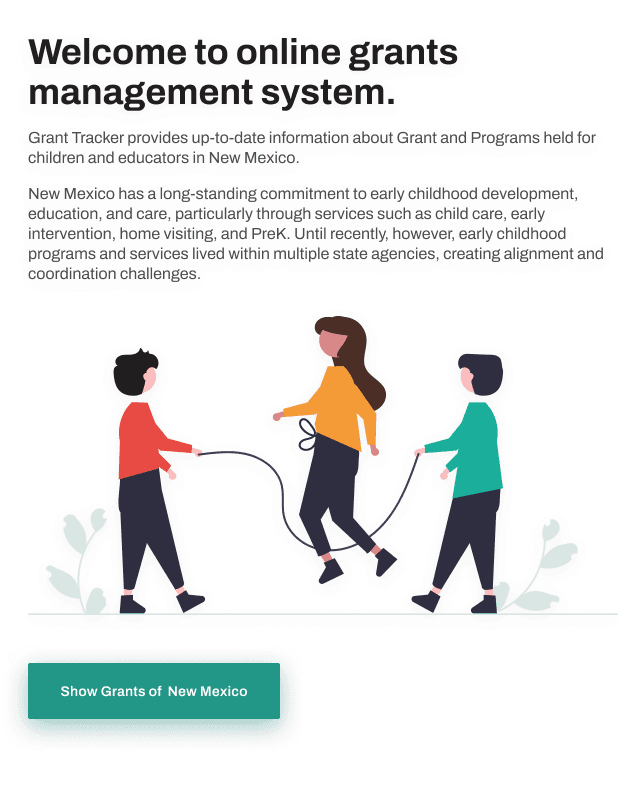
Grant Tracker
Government
Results
Dashboard became the centerpiece for funding presentations, both internally and to elected officials Significantly reduced the need for ad hoc data preparation across departments
Link
ECECD Financial Dashboard – Built a Public Tool to Increase Clarity and Confidence in Early Childhood Funding
Project: Public-facing financial dashboard redesign
Outcome: Transformed a static reporting tool into a decision-support system for staff, officials, and the public
Client: Early Childhood Education and Care Department (State of New Mexico)
Role: UX Designer & Product Strategist
Team: 1 Data Analyst, 1 PM, 2 Engineers, 1 Policy Advisor
Duration: 12 weeks
TL;DR
I redesigned a public dashboard for early childhood program funding in New Mexico. The result: 8,000+ monthly public visits, unified legislative reporting, and a 64% improvement in stakeholder confidence—turning a data dump into a decision tool.
Outcome / Problem Statement
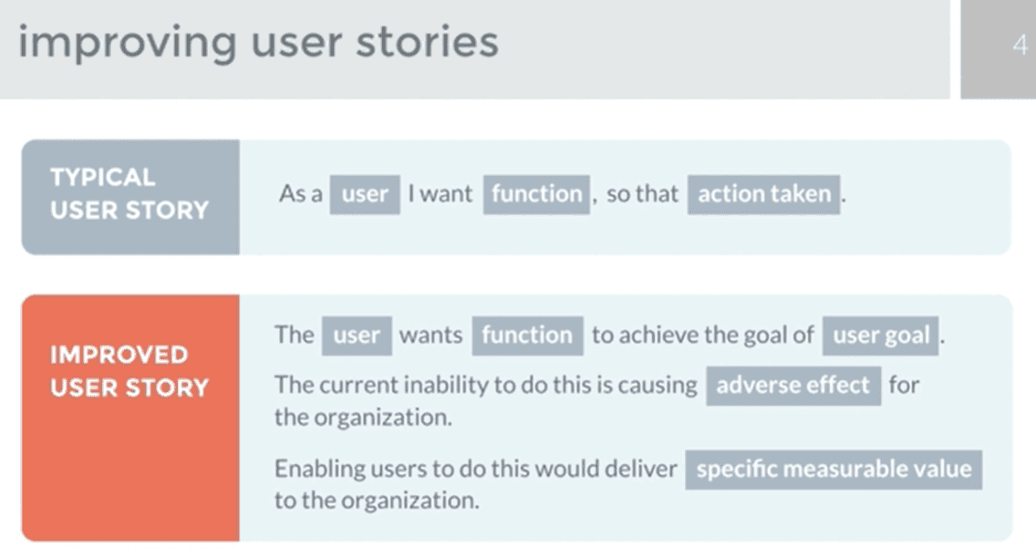
The original dashboard was data-heavy but meaning-light. It showed numbers without offering insight or direction.
Internal staff relied on manual reporting
Officials couldn’t extract relevant funding outcomes
Public users didn’t understand what the data meant or how it affected their communities
Stakeholder confidence sat at 2.8/5
Goal: Redesign the dashboard to support strategic decisions, increase transparency, and enable non-technical users to interpret complex financial data.
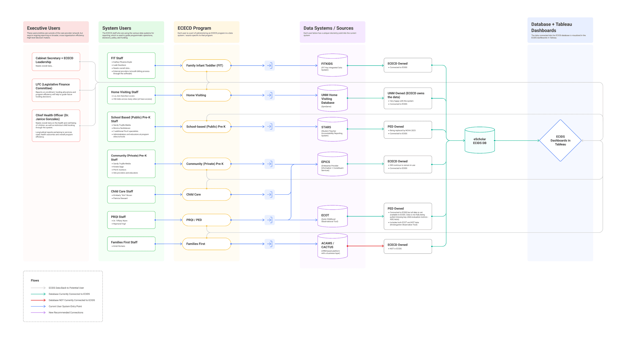
Users and Needs
Primary audiences included:
ECECD staff needing real-time program coverage data
Elected officials seeking outcome-based metrics for decision support
Public stakeholders wanting a plain-language, navigable view into early childhood investments
Most users didn’t want more data—they needed the right data, clearly explained, in the right context.
My Role and the Team
I led UX strategy and product direction for the redesign.
Conducted user research and workflow mapping
Reframed data display around core policy questions
Created responsive wireframes and tested interaction models
Partnered with engineers and data analysts to connect visuals with real-time pipelines
Constraints and Process
Constraints:
Wide range of stakeholders, from technical analysts to lay users
Multiple, siloed data pipelines
Political sensitivity around funding equity
Process:
Stakeholder interviews and legacy usability reviews
Workflow mapping of reporting needs and data access
Content and data audit to identify meaningful metrics
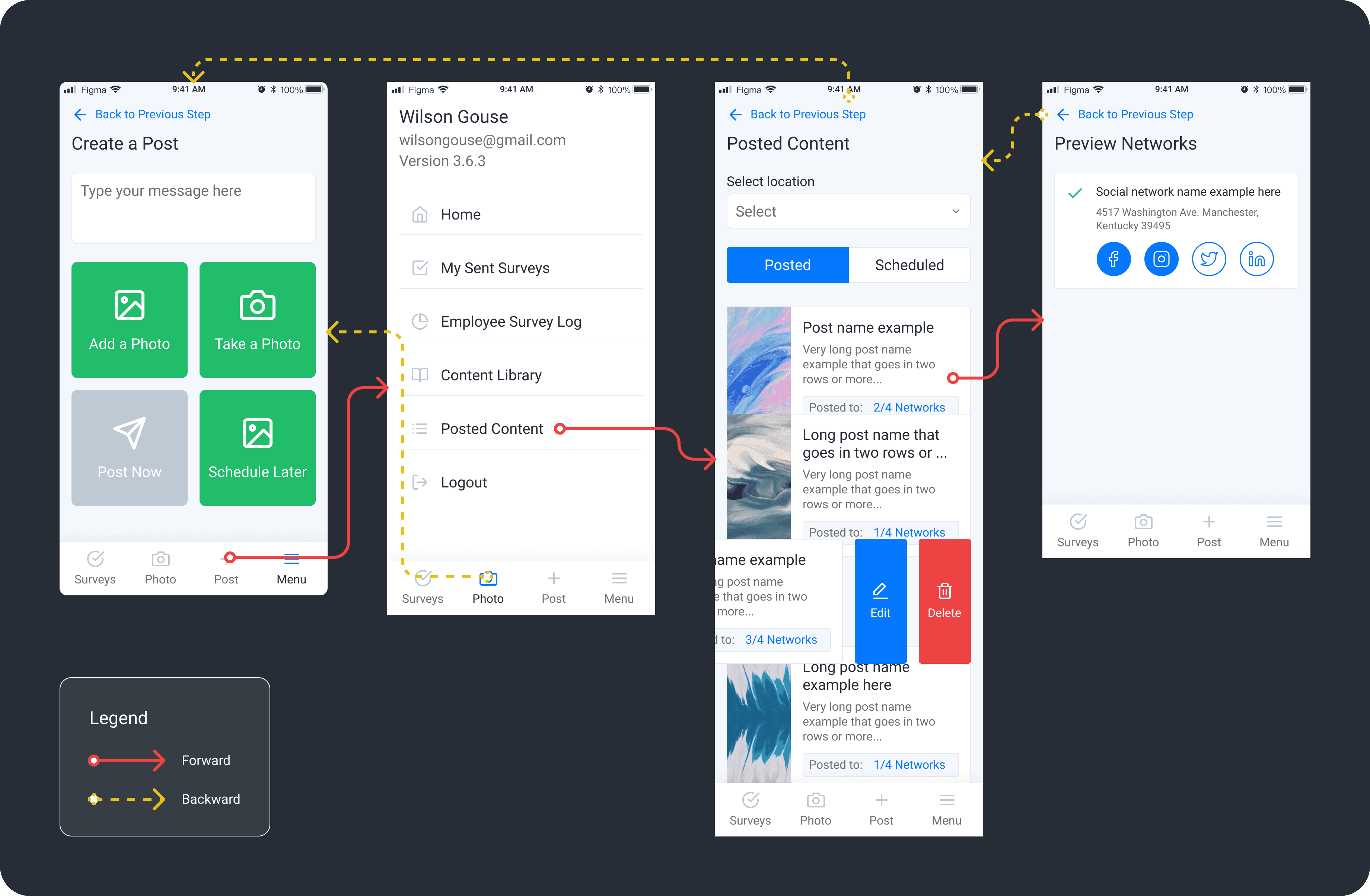
Lo-fi wireframes, then mid-fidelity responsive prototypes in Figma
Onboarding strategies and contextual guidance embedded throughout the design
Design and Iteration Highlights
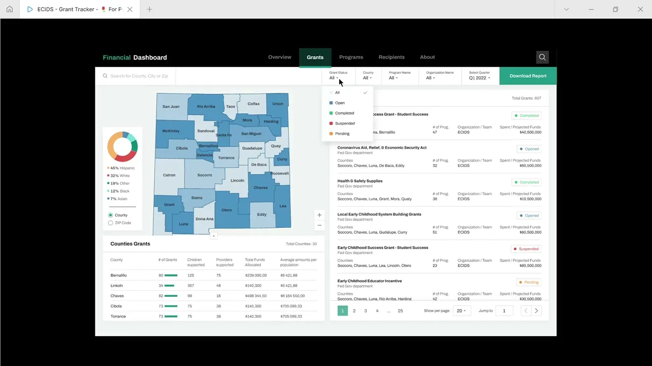
User-Centered Segmentation: Created views tailored to internal staff, policymakers, and public users—within a unified tool
Narrative-Based Layout: Reorganized dashboard content around high-level policy questions rather than raw data tables
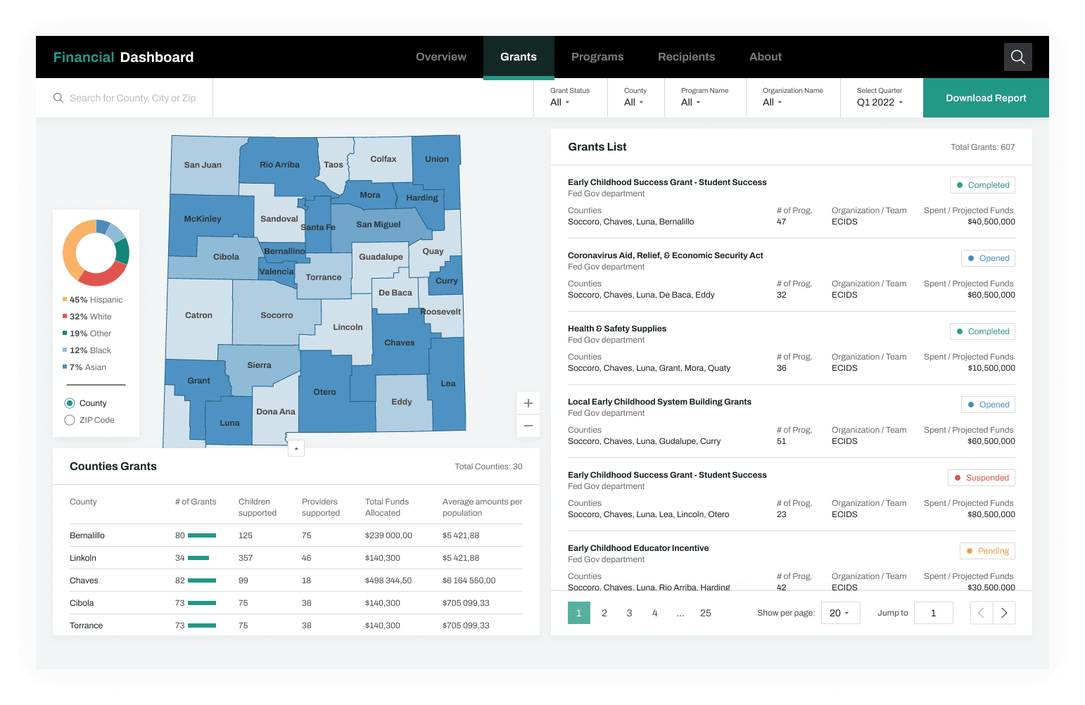
Interactive Maps and Snapshots: Region-level filters and program overviews supported exploration and comparison
Progressive Disclosure: Simplified entry point with deeper drill-downs available for analysts and planners
Integrated Onboarding: First-time walkthroughs, embedded glossary terms, and contextual tips reduced friction
Results (Before vs After Launch)
Metric | Before | After Launch | Result |
|---|---|---|---|
Internal Fund Reporting | Manual | Real-time dashboard | Improved efficiency |
Dashboard Engagement | N/A | 8,000+ monthly visits | Established public baseline |
Regional Equity Tracking | Rare/manual | Daily through UI | Operationalized use |
Legislative Briefings | Fragmented | Unified dashboard export | Streamlined workflows |
Stakeholder Confidence (Survey) | 2.8 / 5 | 4.6 / 5 | +64% improvement |
The tool became a central resource during legislative sessions and directly contributed to ECECD’s next-phase approval for statewide integrated data efforts (ECIDS).
Design Features That Delivered
Impact Snapshot: Quick stats on funds distributed, children served, providers supported
Interactive Map View: County-by-county insights with filters for program type and funding stream
Drill-Down Analytics: Demographic, programmatic, and regional breakdowns
Narrative Cues: Captions, comparisons, and visual markers explained trends and changes
Built-In Guidance: Tooltips, glossaries, and onboarding tutorials helped non-technical users stay confident
Iteration Example
Initial Design:
Static bar charts with complex policy language. Users described the tool as "unclear" and “not useful for communication.”
User Feedback:
“I see the numbers, but I don’t know what to do with them.”
“This doesn’t help me talk to my constituents.”
Redesign:
Added narrative captions, comparative stats (“This county received 18% more funding YoY”), and callouts for funding gaps and progress.
Reflection
The breakthrough was treating data not as an output—but as a story. Users didn’t need more charts; they needed interpretation, guidance, and structure.
The key lesson: design for comprehension, not just display. When clarity becomes the product, trust follows.
Next Steps
Add demographic filters to improve equity-focused insights
Launch Spanish-language and multilingual versions for accessibility
Integrate dashboard views into ECECD’s internal planning and funding workflows
Would you like this converted into a slide deck or presentation format? I can also prep a printable PDF version or Notion entry if you’re building out your portfolio.